

OFFERUP ILLUSTRATION SYSTEM
A complete refresh of the OfferUp illustration style, this project launched alongside OfferUp’s app redesign in the fall of 2020. The new illustration system is composed of ~170 different components, a set of guidelines, and a library in Sketch, Illustrator and Figma. I was the owner and lead visual designer for this 8-month project, working alongside one other visual designer from start to finish. We went through multiple rounds of product, UX, marketing and executive buy-in before launch.

RESEARCH
The first step in this project was pulling examples from the best-in-class leaders in visual design, and understanding what makes their illustration system work well with their overall visual design (as well as their user experience). We took notes on key characteristics like overall tone, vibrancy, backgrounds/settings, depictions of people, and frequency of illustration use in their product. Summaries of our researched brands are shown here below.
(click to expand)


We also took time to dig into our own brand. The OfferUp illustration style had been around since late 2017. It was built with the idea of simplicity and friendliness.
Speaking to key stakeholders across the company, we collected feedback on what people liked and did not like about the OfferUp illustration style. A few key “likes” and “dislikes” stood out across the board.
Likes: Friendly, cheerful, easy to see on a small screen, bright, fun
Dislikes: Too childlike, “looks too much like a kids’ drawing”, too bright, not appropriate for serious/business settings

After conducting visual research, we started to read up on best practices for establishing a new illustration system, including interviews, case studies and other related readings from industry leaders. Some of our favorite pieces we chose in our research are listed here:
Meet the Illustrator Diversifying Airbnb's Image
https://www.wired.com/story/jennifer-hom-illustrations-airbnb/Meet the illustrator behind Duolingo’s crying owl
https://www.invisionapp.com/inside-design/duolingo-redesign/Inclusive Design: How To Start
https://www.netguru.com/stories/design/inclusive-design-how-to-start
Designing Hopper’s Visual Identity
https://medium.com/life-at-hopper/designing-hoppers-visual-identity-5f7fd28e7d16?Case studies: Airbnb
https://design.studio/work/airbnbStarbucks Creative Expression
https://creative.starbucks.com/Uber Brand System
https://brand.uber.com/guide
It was clear after completing our industry research and getting feedback on our current illustration style that we had work to do. Our key tenants for improving our illustration style were to make our brand more inclusive, more applicable to the B2B part of our brand, and better representative of the values and people of the OfferUp community.
WORKSHOPPING & EARLY EXPLORATION
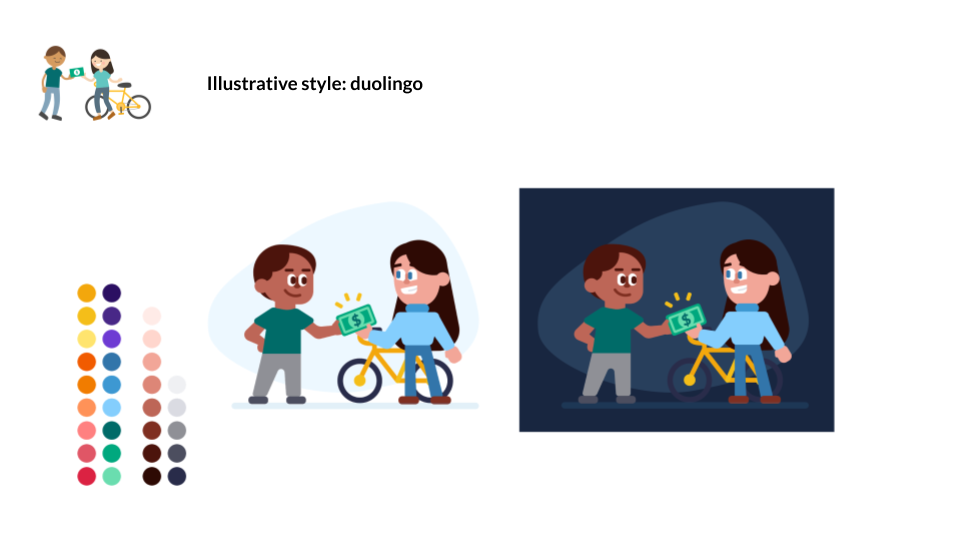
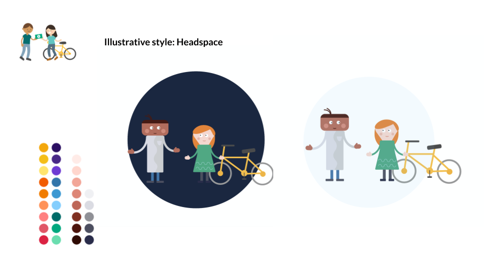
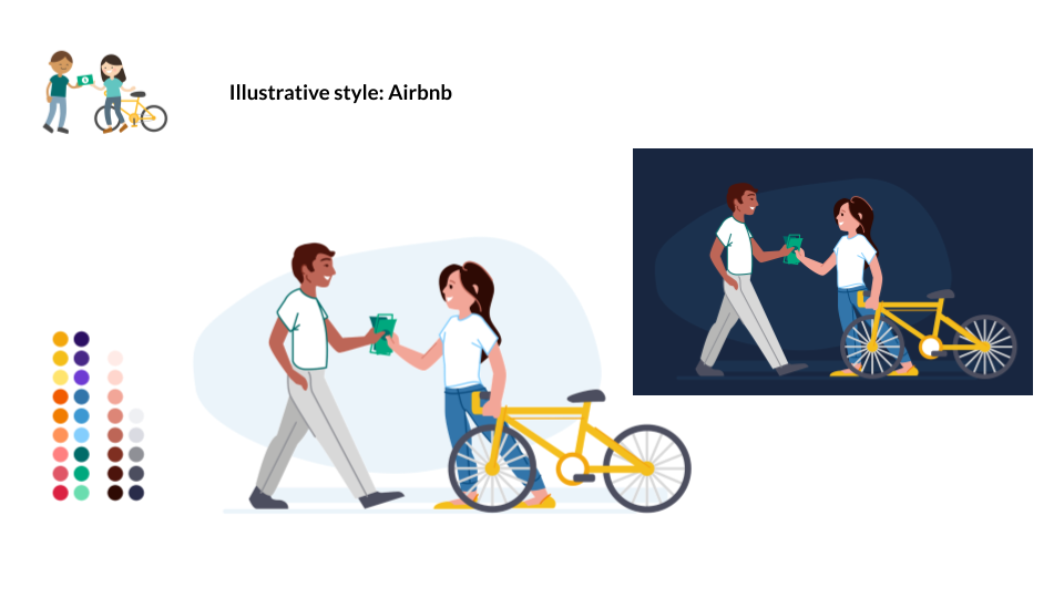
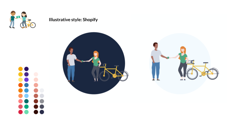
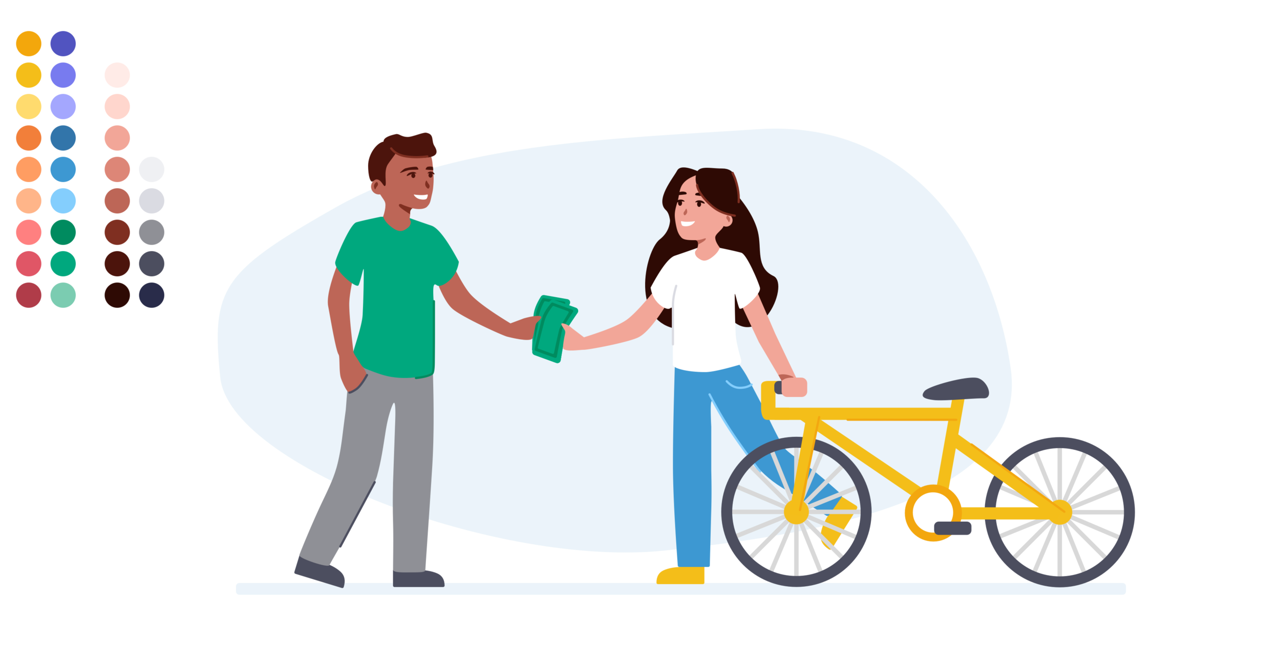
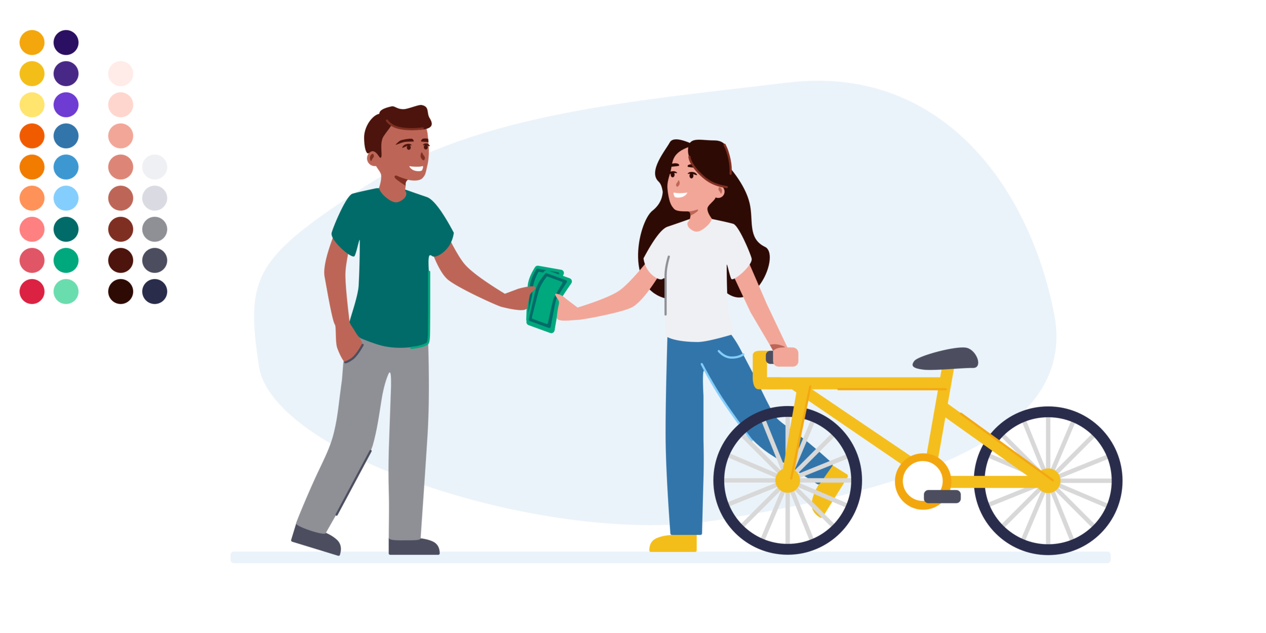
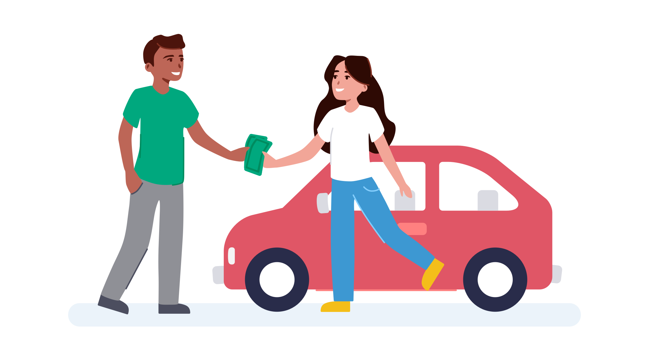
I wanted to start off this project by recognizing what it is about an illustration style that makes it unique. In order to do that, I had the other visual designer on my team and myself do a short workshop where we both take a commonly-used illustration from our current library – a scene where two people exchange money for an item – and recreate it in a few illustration styles that we agreed could be close to the one we wanted to create for OfferUp.
It was a fun way for us to explore what went into the styles of illustrators we admired, and understand what would work for OfferUp when we created our own style. While we were conducting this workshop, our product design team had just wrapped up the color palette they wanted to use for our app redesign, so we began exploring a possible color palette for our illustrations to complement the colors in our product design. You can see the new colors in play in the explorations below.

Back to the drawing board
After conducting the illustration style workshop with other brands’ styles, our team of two broke off to sketch out some ideas for what our style could look like if we used our favorite parts of the styles we explored to create something new. We did these explorations in both vector graphics and in drawings/sketches done in Procreate. This helped us identify what themes we thought would work well as a style of our own, and what we needed to drop or change.
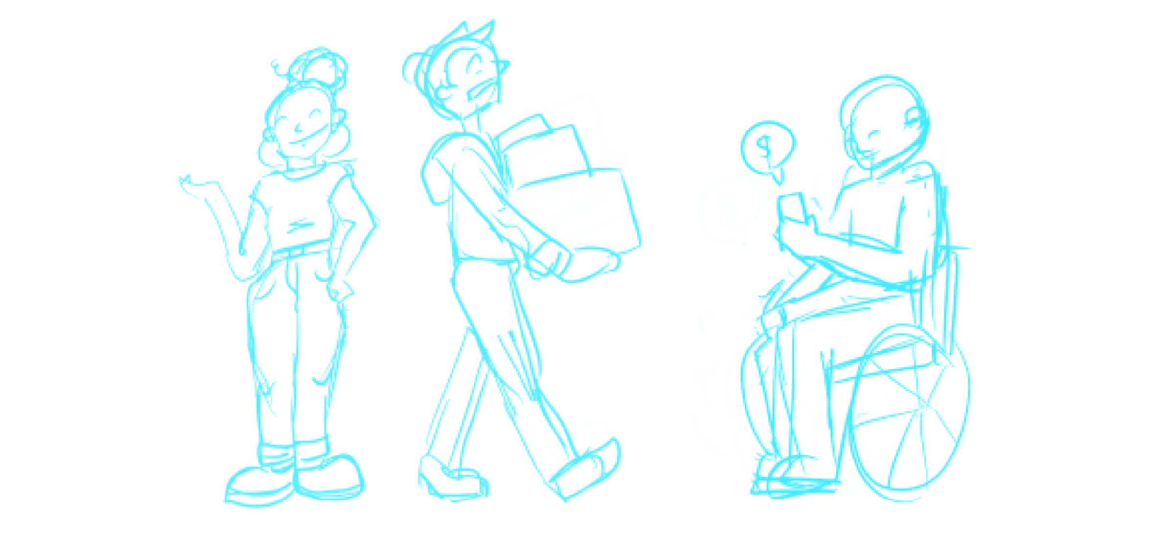
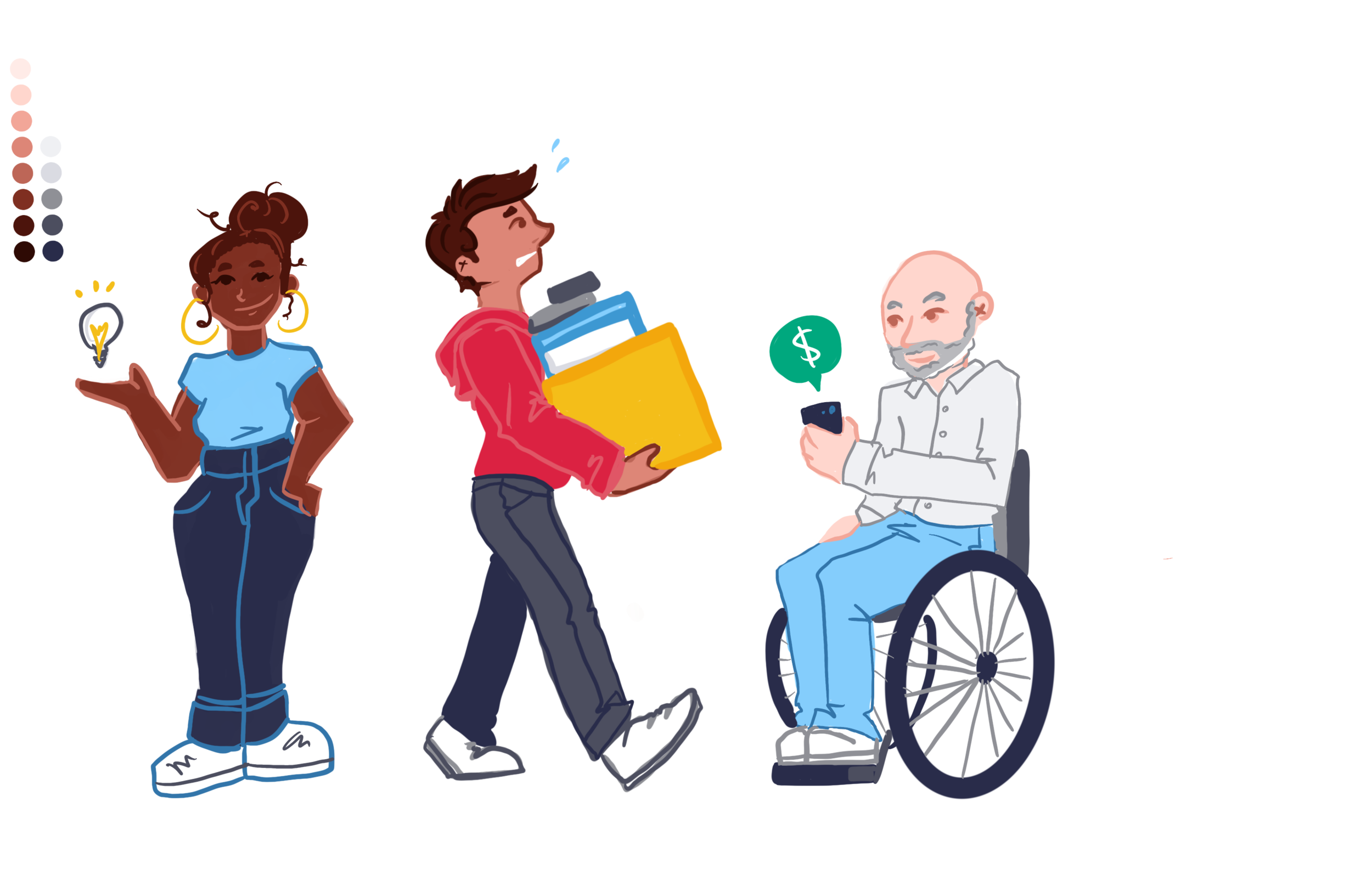

After creating our own original illustrations, we spent a day writing down our first set of guidelines for our style while comparing our explorations to each other, and referencing back to our design research we conducted at the beginning of the project. We quickly identified what was working in each of our styles, and what we wanted to change.
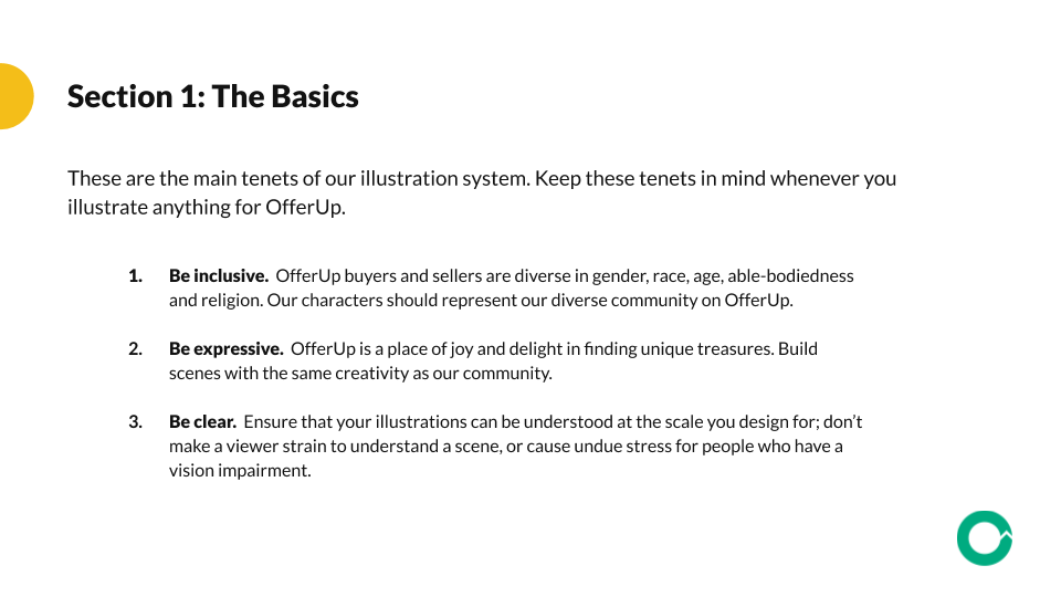
Some decisions we made right away were to keep characters’ torsos always facing forward, to use repeat shapes for noses and ears, to not illustrate the whites of eyes, and to keep all corners rounded. We felt like these design decisions would make our system unique, consistent, and easy to replicate.

Fine-tuning
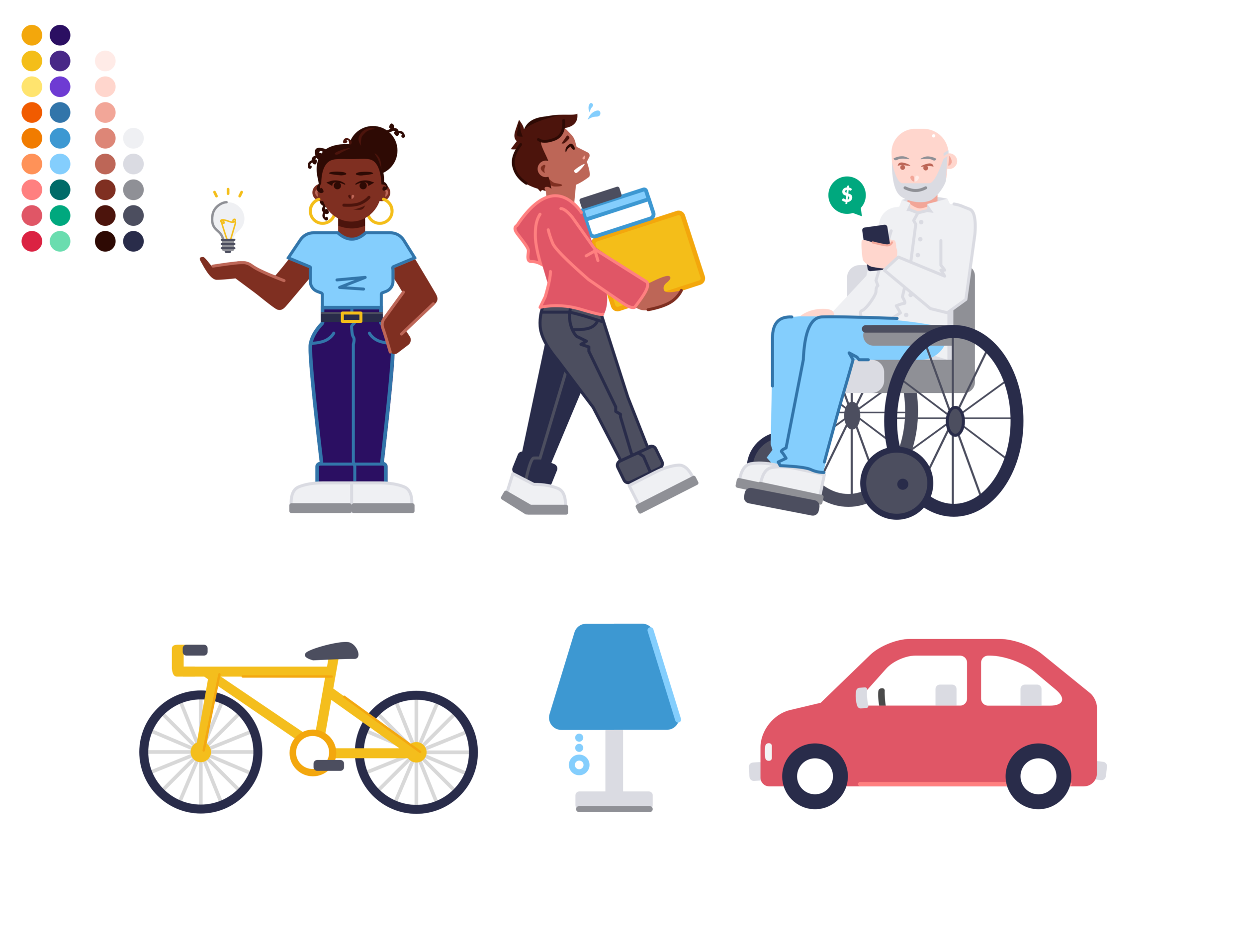
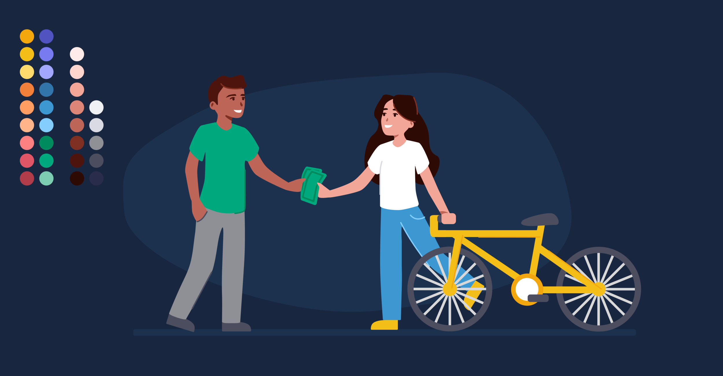
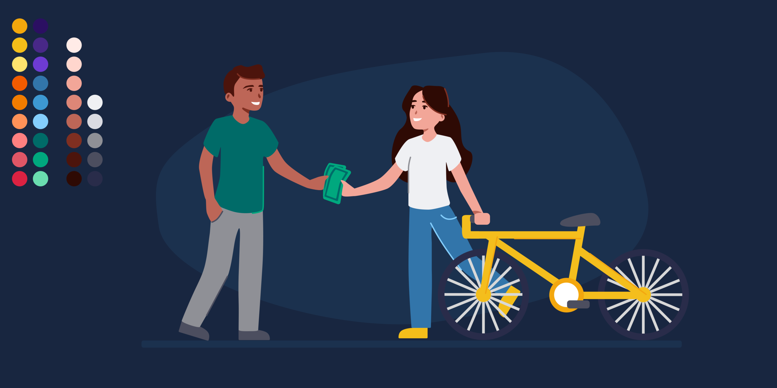
After we completed our workshops, we finally landed on a style we loved. We went back to the scene of the two characters exchanging money for an item, and recreated it again using our system we created, including our own rules and guidelines we wrote for ourselves. Our last piece of tweaking was our color palette. Working with the product design team, we chose to go with a light and bright version of our palette to better suit our app’s new dark mode.
At this point, we took our final concept to our executive board, where we got the green light to go ahead and begin designing in our new style for our redesigned app and our marketing.

final result
Here you can clearly see the difference between the old OfferUp illustration style, and the brand new style we created in 2020.


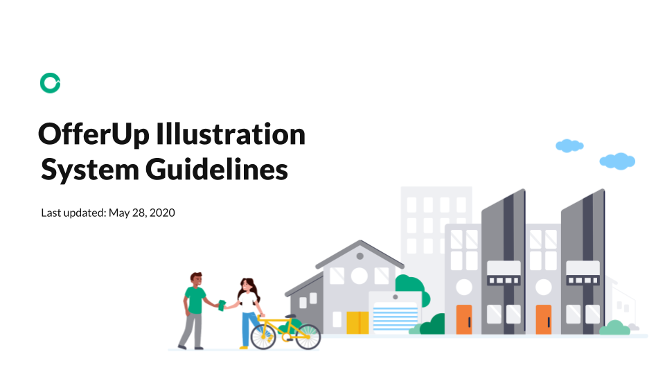
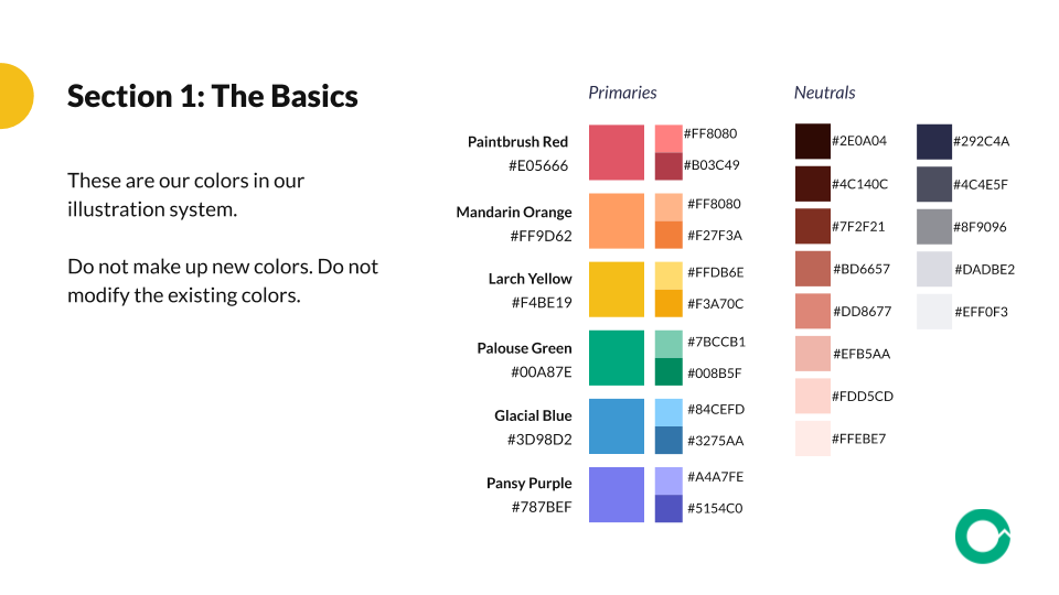
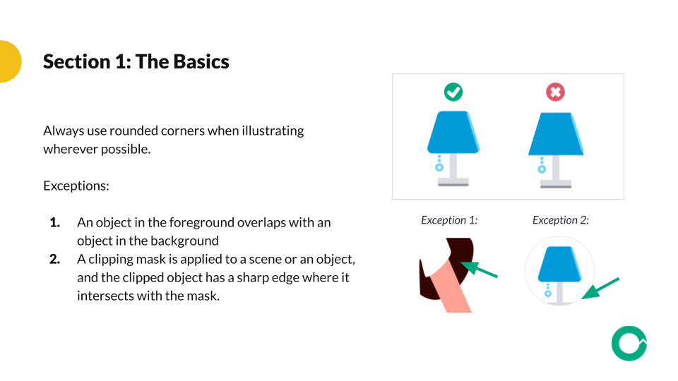
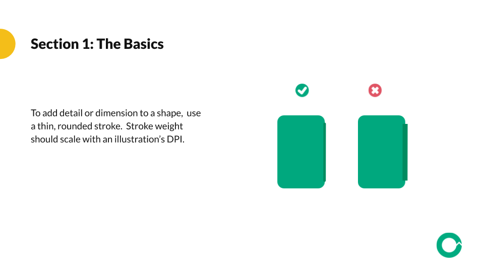
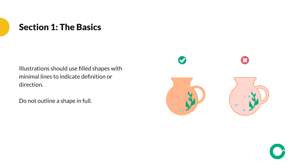
illustration system guidelines
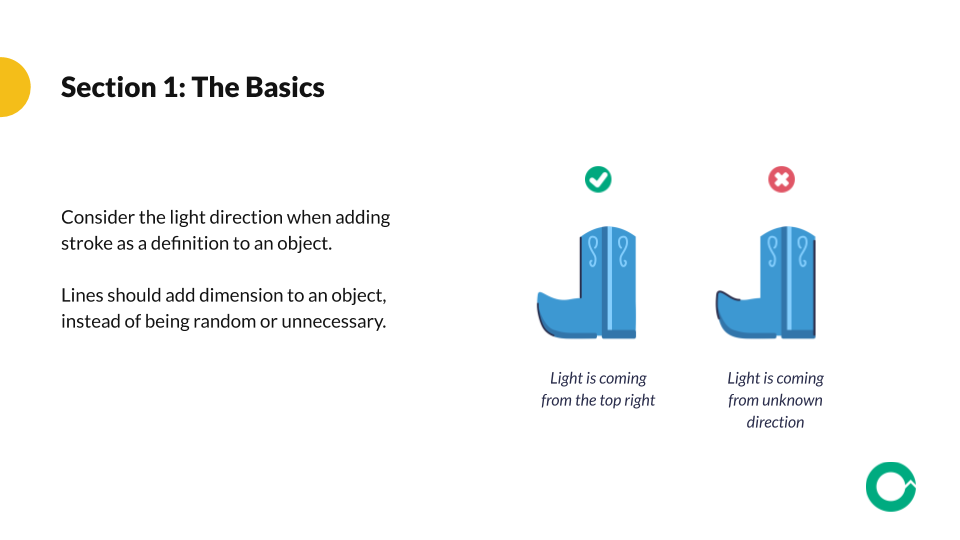
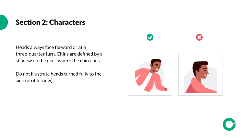
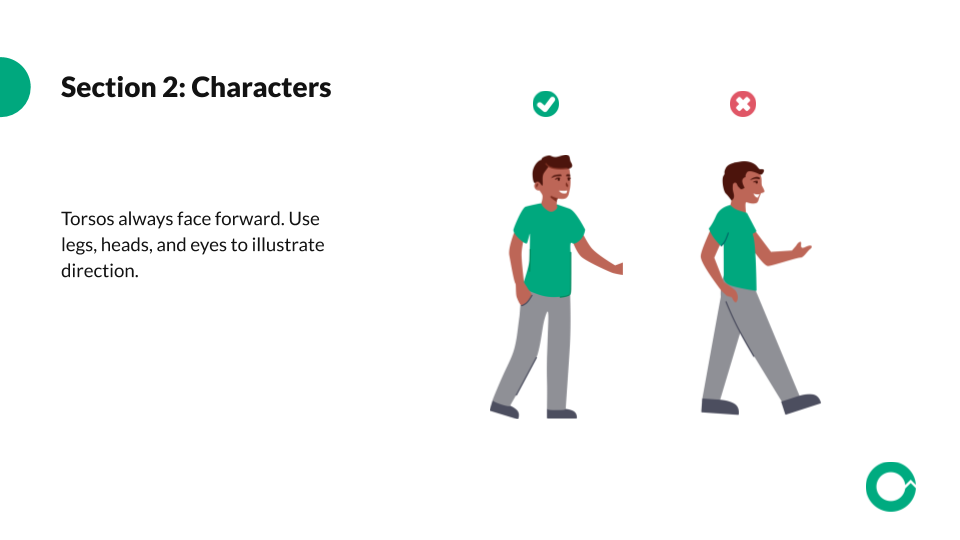
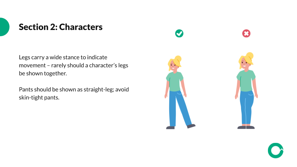
We created a set of guidelines for our illustration system, so that anyone in the company could theoretically design a scene, character or object in our new style. This also serves as documentation for future designers who wish to design in our illustration style.
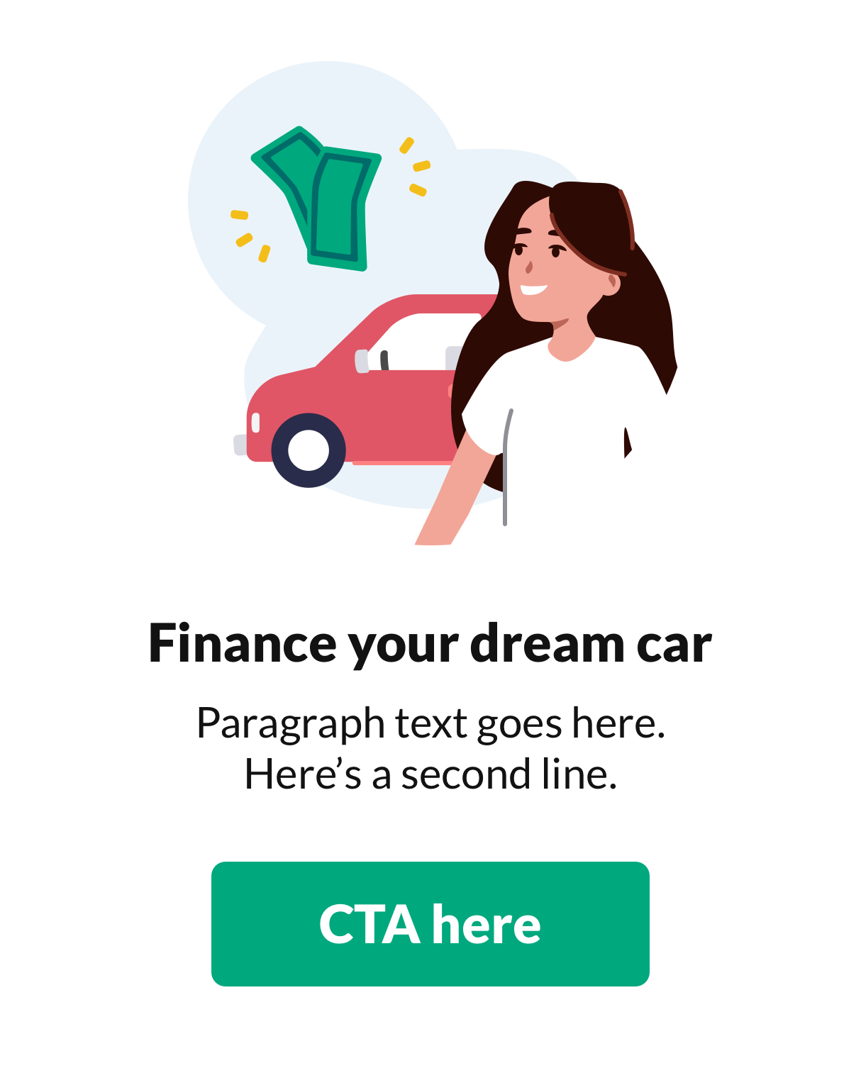
Select slides from our guidelines are shown here:
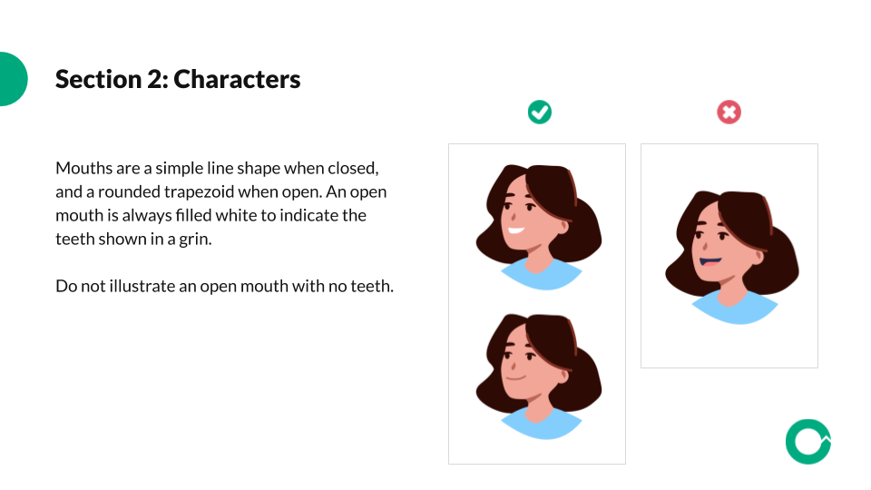
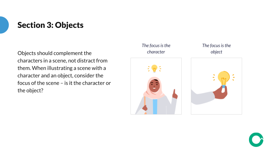
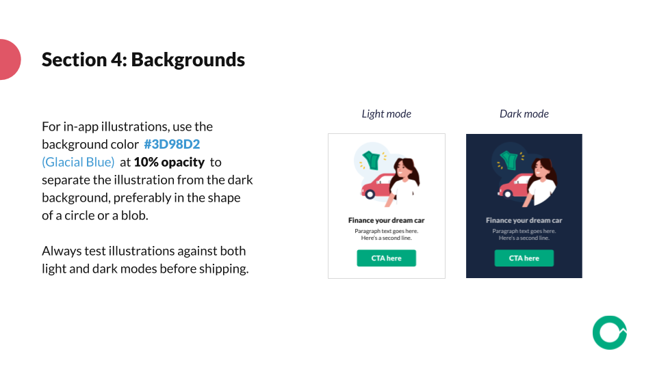
More excerpts from the project
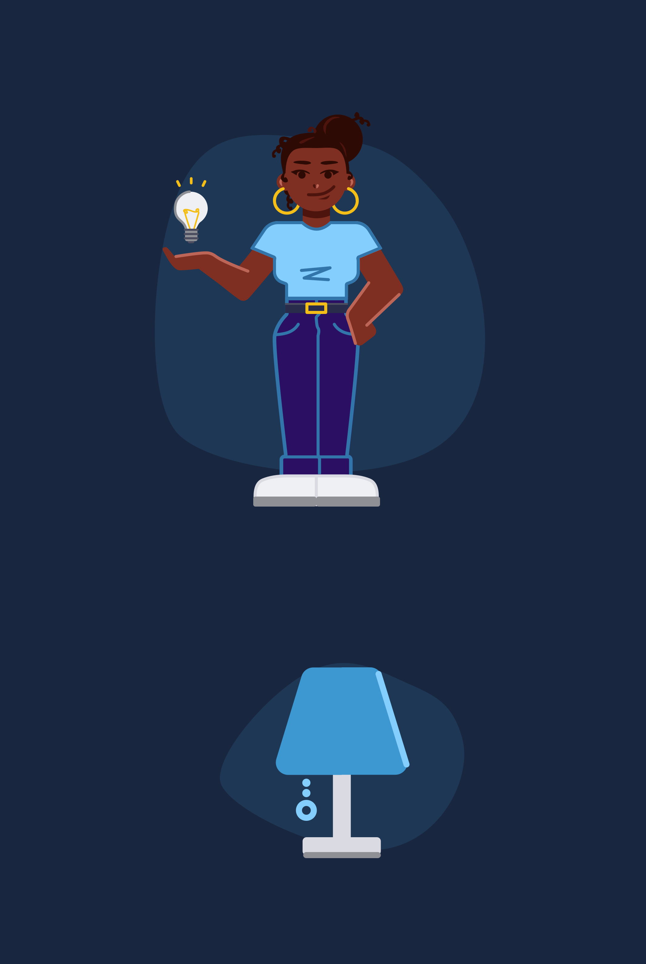
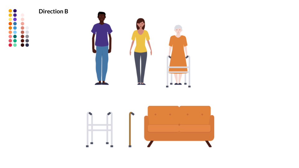
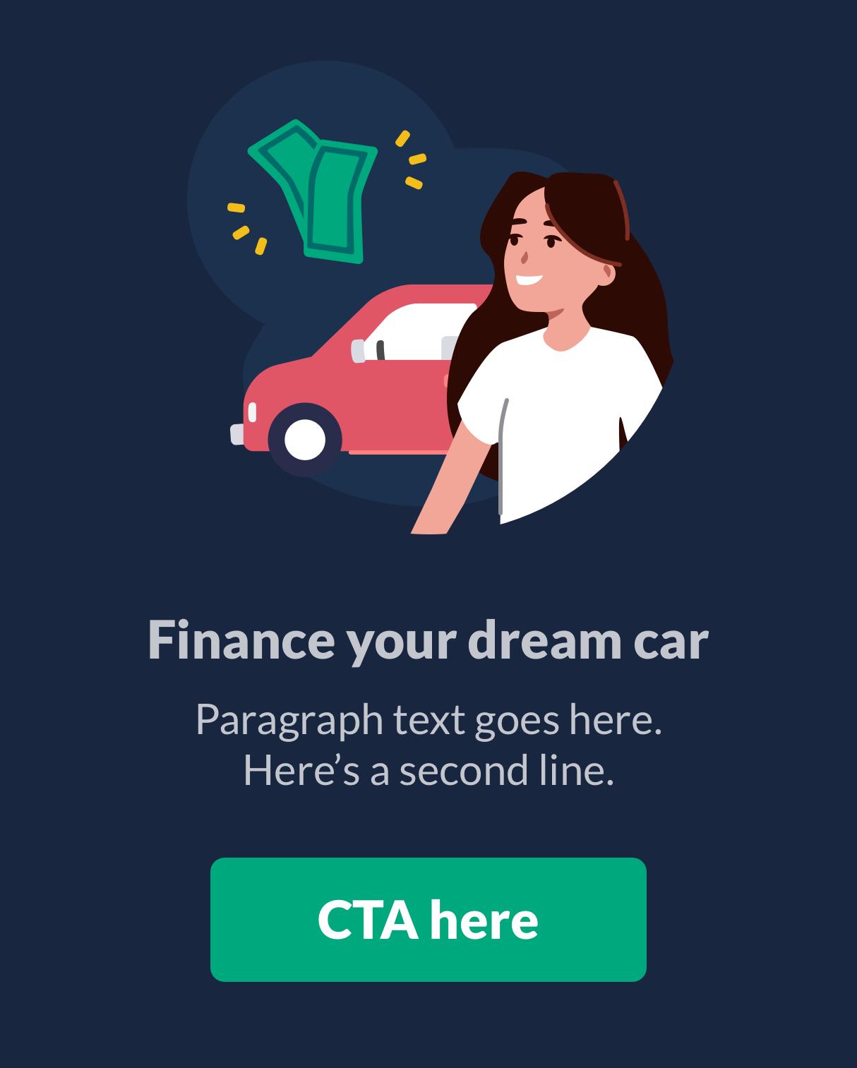
Here are some snapshots of our new style, and examples of how our illustration system’s pieces and parts work together for the OfferUp brand.


The OfferUp internal teams use Google Drive as a file-sharing service, so we created an organized folder of illustration resources accessible to the whole company as a Drive library.


