

OFFERUP & LETGO: “NOW ONE MARKETPLACE”
ART DIRECTOR, LEAD VISUAL DESIGNER, COPYWRITER
May 2020 – September 2020
In May 2020, OfferUp announced that it was acquiring competitor marketplace letgo. The two apps had existed as rivals in the local marketplace space since the mid-2010s.
OfferUp’s strategy in acquiring letgo was to have all of the letgo users migrate to the OfferUp app, temporarily branding the OfferUp app as “OfferUp & letgo”.
I was tasked with art directing the migration, writing the vast majority of the marketing copy, and designing most of the marketing creative on both the letgo and the OfferUp side. One of my favorite parts of this project was learning letgo’s brand guidelines, and producing materials in their visual design style.
Overall, the launch was a success, with millions of letgo users migrating to the OfferUp app and engaging with the OfferUp marketplace. The co-branded OfferUp/letgo app peaked at the #2 app in the Apple App Store and the Google Play Store on August 31st, beat out only by Zoom.

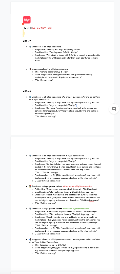
PLANNING & CREATIVE DIRECTION
When I began planning the creative for the letgo acquisition, the first and most obvious hurdle was the adoption and integration of letgo’s brand guidelines. While letgo has a very distinct color that is eye-catching and easy to recognize, it also clashes with the OfferUp green. I had to be thoughtful in how we would marry the two brands in a way that wouldn’t be an eyesore, or look “too much like Christmas”.
An excerpt from letgo’s brand guidelines


An excerpt from the OfferUp brand guidelines


The most effective way I found to start sketching out ideas was the “working backwards” approach of testing out how the brands could appear in the wild. An easy exercise was visualizing how we would picture the two brands in the confines of the small size of an in-app modal. You can see some of the early explorations of the co-branding below.

I also did some explorations into the top-of-the-funnel user experience of someone searching for the letgo app. On the left is one of the earlier concepts for how we would position the two brands for someone who was looking to download the letgo app.
On the right are some concepts for letgo-facing marketing encouraging users to download OfferUp.

While I worked on some concepts for the co-branded creative, I also began to explore how we would lockup the two logos to each other. I explored about 50 different options for how the two logos could work together, and put the strongest contenders in a presentation for our executives. Our executive team chose the winning logo, and I was back to working on creative concepts with the new, approved logo lockup.


Here are some of the explorations I drafted after we had the finished logo lockup. Early feedback from the team was positive in response to the illustrations of the two letgo and OfferUp characters, so I began to work towards a more illustration-heavy direction.

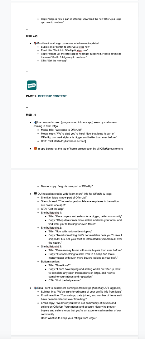
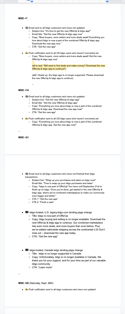
ALL THAT COPY
I was also the main contact for writing all of our marketing copy for this campaign. I owned and regularly updated our “source of truth” document for tracking what type of messaging we were sending when, and what each piece of copy said.
The marketing copy was hotly debated in executive reviews, and the messaging we were planning on sending sometimes changed two or three times a day leading up to the campaign launch. I took charge of drafting new copy whenever an edit was suggested, running it by stakeholders, then making that change on all of our mockups, decks, and our main “source of truth” doc.
Below are some screengrabs of all of the documents I managed, with all of the marketing copy I wrote and organized.


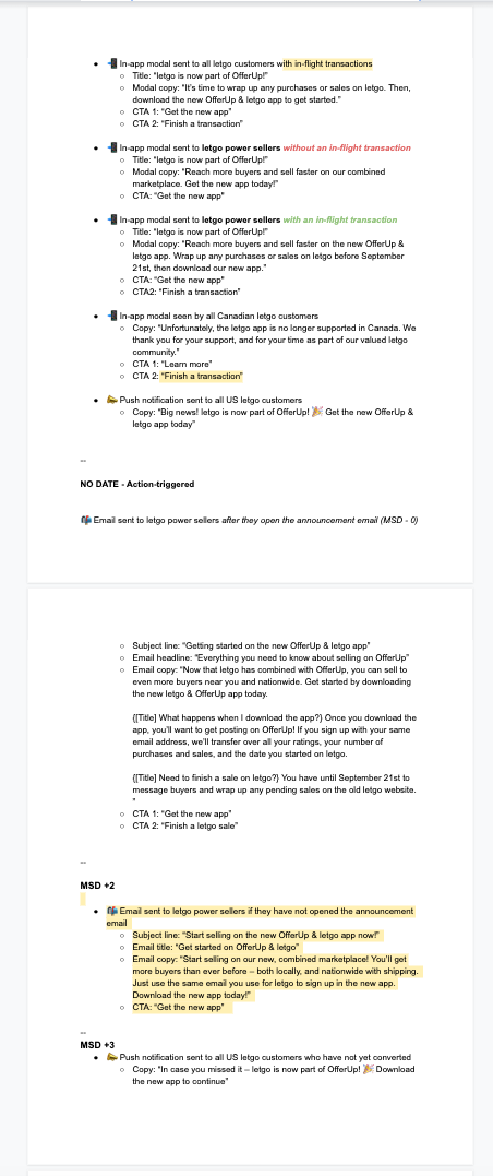
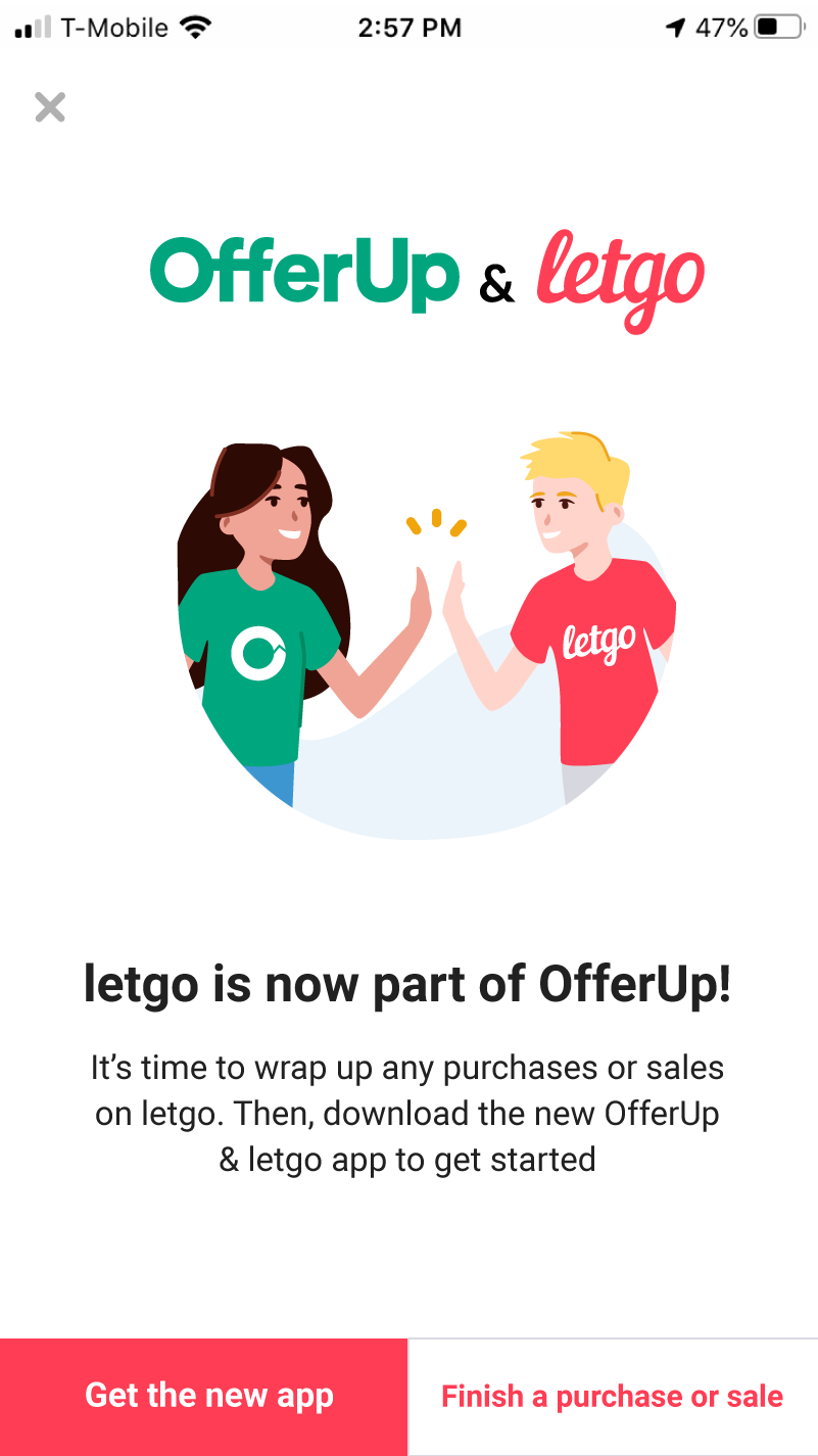
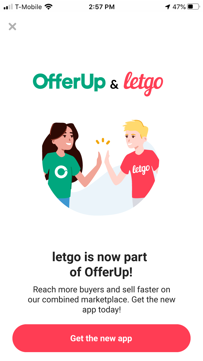
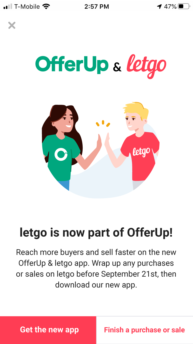
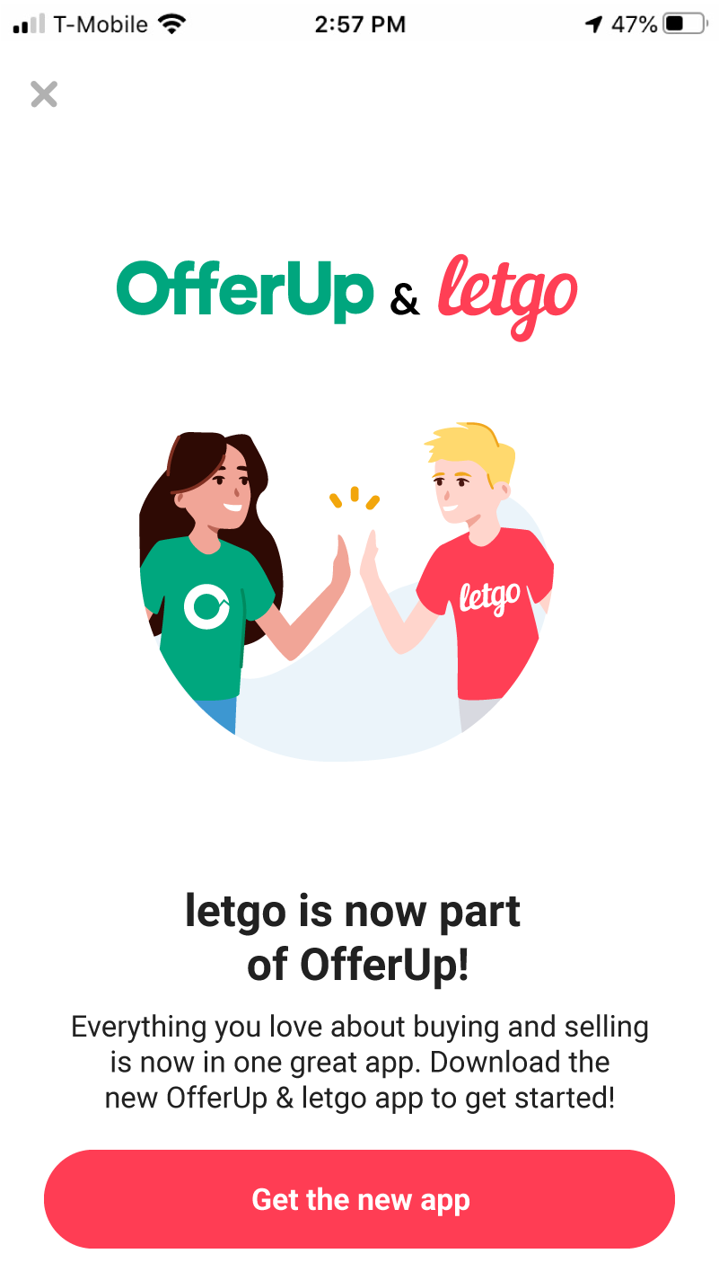
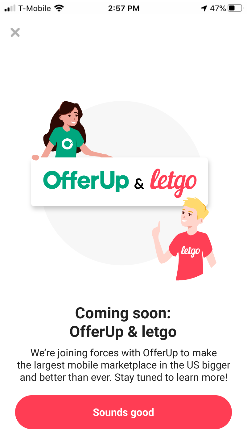
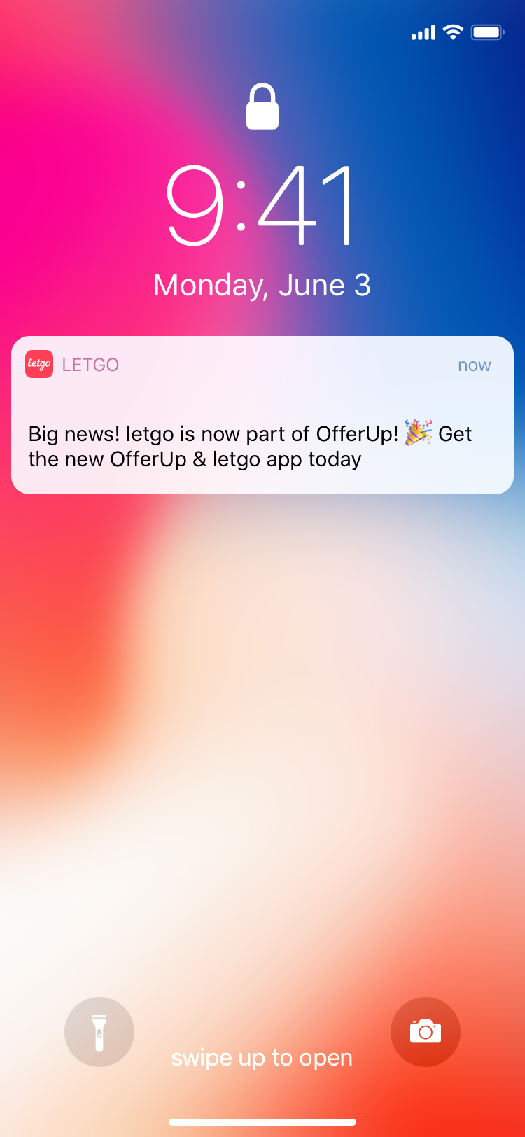
Final marketing creative (EMAIL, IN-APP, PUSH, WEB)
After countless rounds of PM, leadership and executive review, we landed on the designs below for our in-app messaging, push notifications, emails, and web landing pages. All of the final copy was written by me, and all designs except for 4 were created by me personally. The rest all follow my art direction/guidance.
In-app messages
Emails (click to expand)


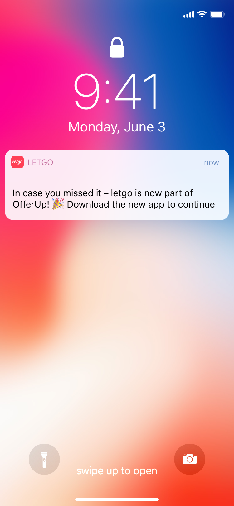
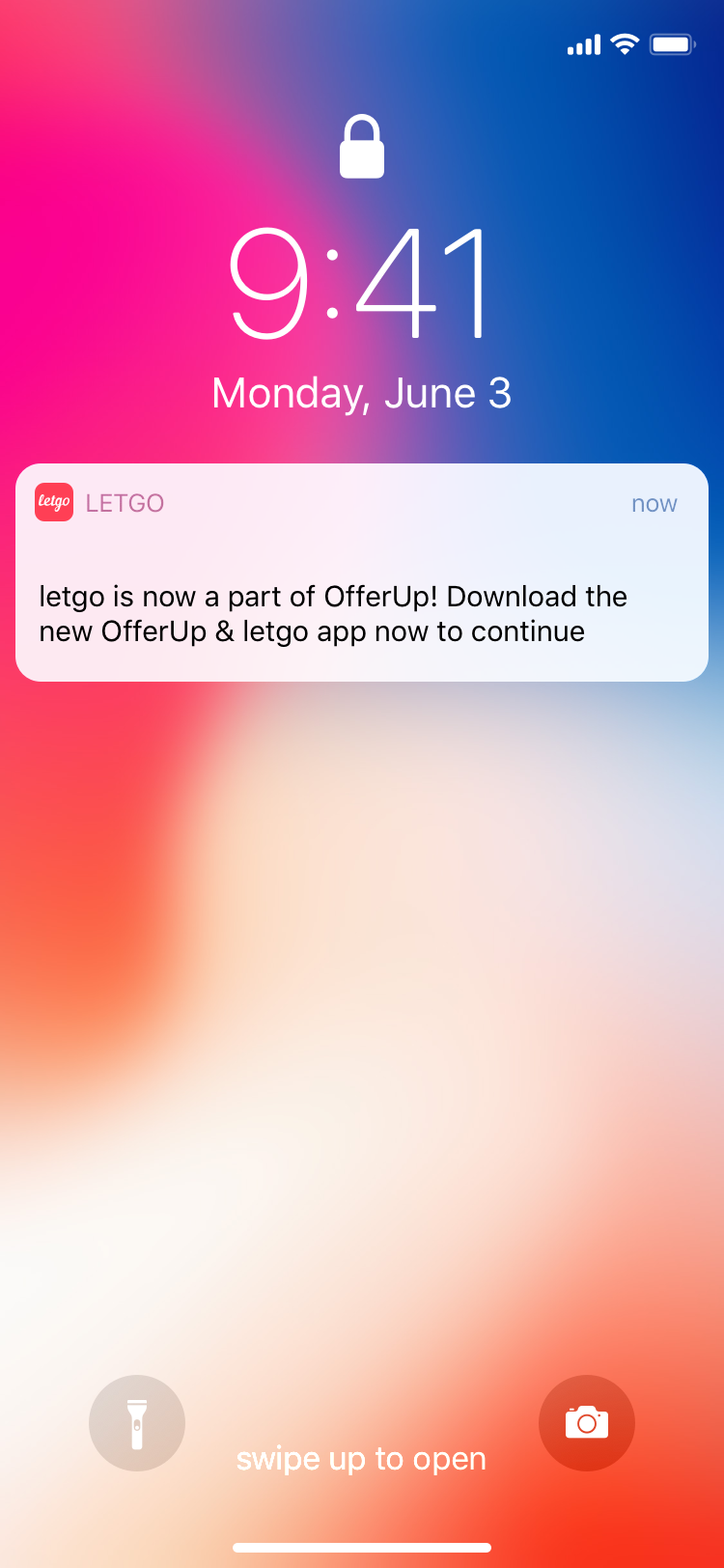
Push notifications


“Learn more” landing page (done in collaboration with the product design team at OfferUp)


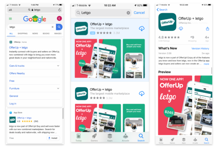
LESS INVOLVEMENT: FINAL APP STORE & SOCIAL CREATIVE
Creative agencies Sid Lee and Jellyfish were working behind the scenes creating content for our organic social media and our final app store designs. Our internal team did not create these assets, but we helped guide the art direction for these agencies. Namely, I provided new, optimized app store screenshots and screen recordings for Jellyfish, and aided in the color, type and composition choices of Sid Lee.
Sid Lee’s work


Jellyfish's work


